How to Choose a Color Scheme for your WordPress Theme
The color scheme you choose for your website will impact your business in a variety of ways. It might not seem like the colors on your site are that important, but they can have a tangible influence on visitor behavior, including how long visitors stay on your website, whether they return, and how motivated they are to buy from your business.
To choose a color scheme for your website, you need to develop a palette. A palette is a selection of colors that complement each other and can be used side by side.

Choosing a color palette used to be the territory of web designers, but you can now use plenty of free online tools to take the reigns and choose a color scheme for your WordPress theme yourself. This post looks at the different factors to consider when choosing a color scheme, and provides a list of resources you can use to create the website your business has been waiting for.
Questions to ask before starting
According to Kissmetrics, color has a huge effect on customer purchasing behavior. 85% of shoppers cite color as the primary reason why they buy a product while 52% of online shoppers don’t return to a website because of its overall aesthetics!
As you can see, color plays a large role in customers’ experience of your site, fits in with your existing content and branding, and suits your customer base.
- Do you have existing branding?
If you have existing branding, you need your website color scheme to match this. Not only will your website look unprofessional if it doesn’t, but it will damage your efforts to create a recognizable online brand, and potentially make your website less memorable to visitors.
- Do you want to include any photos or images?
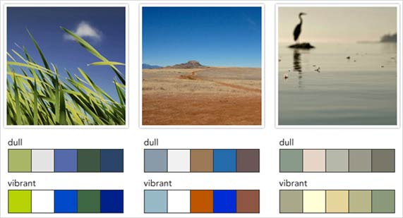
If you have specific images you want to include on your website, or you already have existing content that contains photos and images, your color scheme must match these.
- Who is your target audience?
You need to make the color scheme relevant to your visitors. For example, if the majority of your visitors are men, you don’t want to choose pink as the primary color for your site.
- What are you selling?
If your business sells services, this is harder to translate into appropriate colors. If you sell products, however, think about your defining products and the colors they represent. For example, if you sell eco-friendly products or natural products, greens and blues will fit well with your catalog.
Choosing Colors
Now you have a clearer idea about what colors you should and shouldn’t be using on your site and WordPress theme, here are a few tips to help you develop an effective color palette:
- Keep it simple
Use a maximum of three main colors on your website. You can see this in the Flexible theme from Elegant Themes. The theme looks elegant, with teal, ivory and cream showcased as the main colors of the theme.

- Use the 60-30-10 ratio
I highly recommend using the 60-30-10 ratio rule as a starting point. The primary color in your palette will be present over 60% of your website, and sets the overall tone of your design. The secondary color you choose for the 30% ratio should contrast with the primary color to create a visually striking effect. Lastly, the 10% color is an “accent color”, which complements either your primary or secondary color.
A useful tip is to make the primary or secondary color a neutral tone, such as black, white, or gray. This gives you more options to choose from when selecting the other two colors.
- Choose widely available colors
As your website is a crucial part of your branding, I recommend choosing colors that are widely available. If you want to expand your branding to items like t-shirts, postcards, or similar printed materials in the future, you need the printer to be able to match your color. Otherwise, you will either have to pay more, or will end up with branded items that don’t match!
Color Psychology
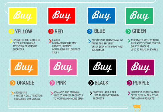
As Kissmetrics demonstrates, different colors can have different psychological effects on customers. Here is a summary of how colors can influence buying habits:

- Yellow:
An optimistic and youthful color, yellow is often used to grab the attention of window shoppers and can have the same focusing effect on websites. - Red:
Red conveys energy and a sense of urgency. It is often used in clearance sales. - Blue:
Blue is associated with trust and security. You see this color a lot on business and financial websites. - Green:
Green is associated with wealth and relaxation. It is the easiest color for eyes to process. - Orange:
Orange is an aggressive color, often used for calls to action, for example when asking people to subscribe or buy an item. - Pink:
Pink is romantic and feminine, therefore it is often used to market to women and girls. - Black:
Black is powerful and sleek, and conveys luxury. It is often used to market high-end products, and in male-dominated markets. - Purple:
Purple is supposed to be soothing and calming. You will often see shades of purple in beauty or anti-aging products.
As well as different colors having different effects on shoppers’ psychology, different types of colors appeal to different types of shoppers too. Red, orange, black and blue attracts impulse shoppers, teal and navy blue tends to be more attractive to shoppers on a budget, while pink, sky blue and rose are more appealing to traditional buyers. Thus, do bear all these color tips in mind when you are choosing a theme for your website or blog!
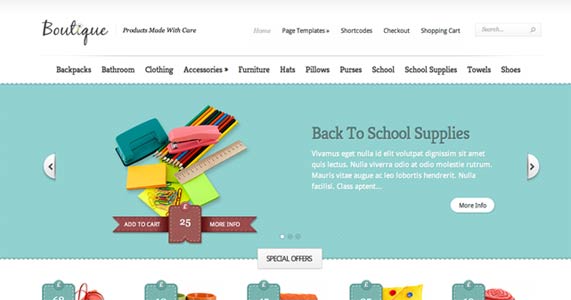
You can see in the example below, using Elegant Themes’ Boutique ecommerce theme, that the website uses teal for the slider background and the price tags, positioning themselves as more attractive to budget shoppers.

Changing a Color Scheme in WordPress
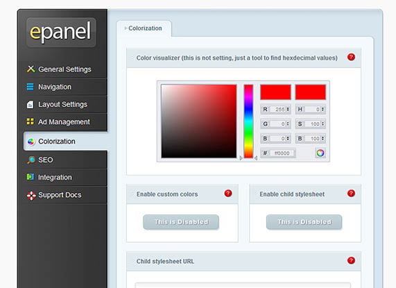
To create a customized color scheme in WordPress without changing the theme’s code, you need to use a premium theme that gives you customization options in the Control Panel. Elegant Themes are my favorite premium WordPress theme provider, and they have a specific section called “Colorization” that enables you to control the color scheme of your theme, easily!

The color visualizer tool enables you to find the hexdecimal values of the colors you want to use before making any changes to your blog. Using Elegant Themes’ settings, you have complete control over which colors you use in different areas of your blog. For example, you can change the color of specific elements, such as the background, font, links, and hover text. You can also enter your own child stylesheet!
Resources
Below is a list of online resources you can use to help you choose the color scheme for your WordPress theme.
- ColourLovers is a website specifically for non-designers. The site contains a wealth of information about creating color schemes, as well as tools to help you create your own palettes and discuss color-related topics with other users.
- Kuler by Adobe is a web-hosted application for generating color themes. You can develop your own color themes, and view themes other users have created too.
Color Palette Generator lets you generate a color palette based on an image. Simply upload the image to the website, and it will display a color palette drawn from that image. This is useful for generating color schemes based on a logo, for example. - Color Hunter is similar to Color Palette Generator in that it generates color palettes based on images you upload. Using color hunter, however, you can also view other images and their related color palettes too.
- Colr analyzes images and picks out all major colors present. It then creates custom color palettes based on the results.
Conclusion
Using the questions, hints and tools above, you can create a color scheme for your website that appeals to your customers and increases the attractiveness of your products and services. Use these information when you are choosing a WordPress theme, you can create consistent branding, and visually pleasing web pages that will encourage customers to return to your site again and again.